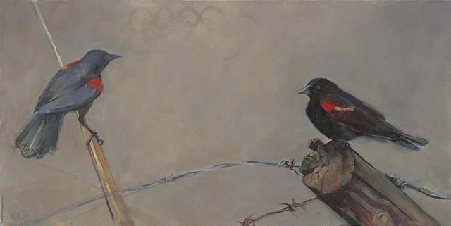
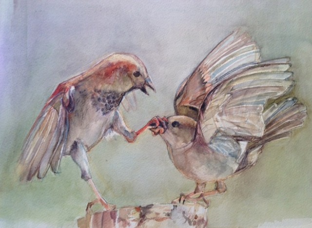
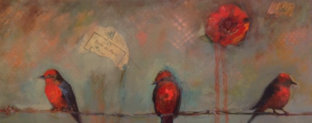
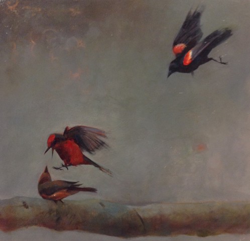
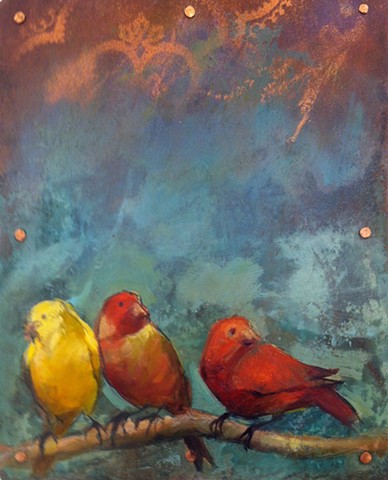
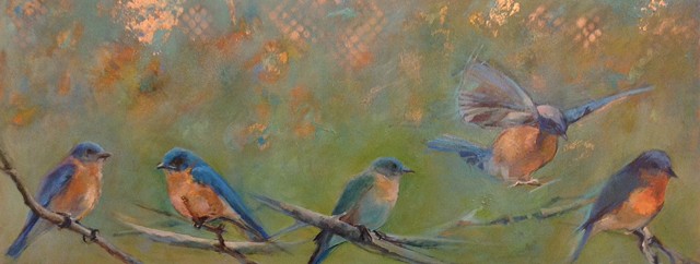
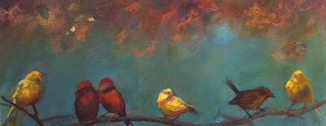
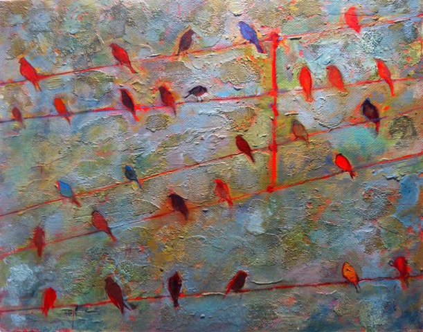
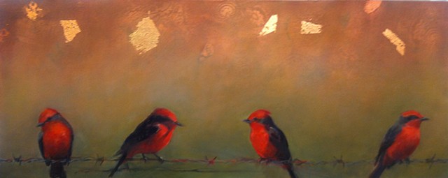
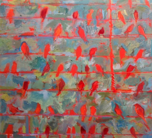
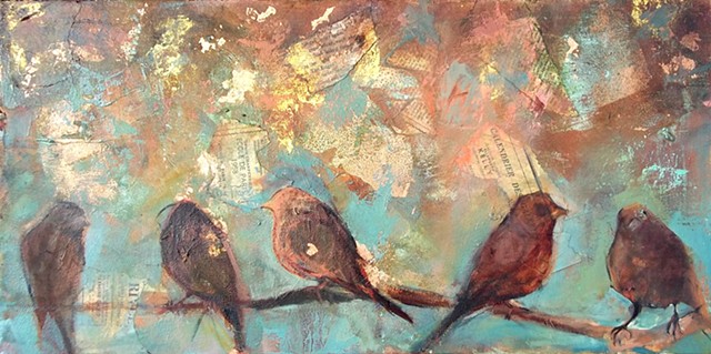
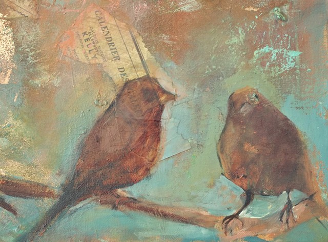
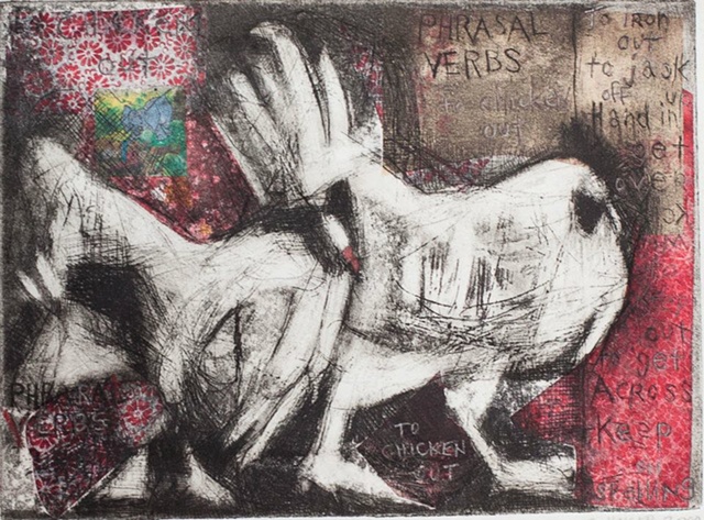
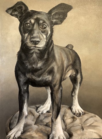
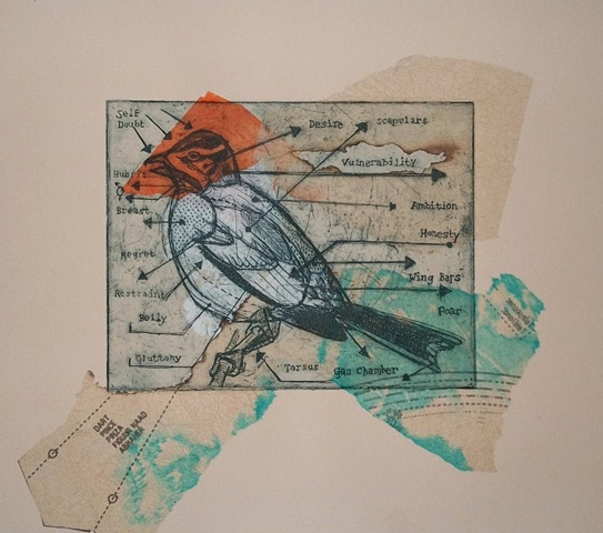
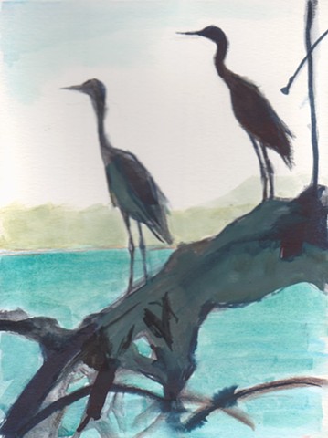
My recent series of paintings explores birds. I depict them as silhouettes sitting on telephone wires and power lines. They remind me of musical notes on a scale. I have gravitated to the subject while teaching designthe repetition of form enables me to create unified, harmonious compositions.
When I teach design, I convince the students that Less is More. Thus, I have pared down my otherwise complex subject matter to lay bare the muted colors that inflate the negative spaces in my work.
In terms of color, I gravitate toward muted neutrals inspired by clouds: mostly ominous and roiling with occasional bursts of hope inspired by a sunrise. I aspire to find the color in gray skies---I mix complementary colors to find a neutral balance. Design: Negative space: muted hues. Less is more My application of paint is textural; I prefer an impasto application of broken color. I scratch into the surface in the same manner in which I execute an etching. The sgraffito technique is quite physical, and my experience as a printmaker has driven me to agitate the surface of my paintings. Culturally, a bird is a loaded symbol that can be interpreted in numerous ways. For me, birds represent simplicity. 
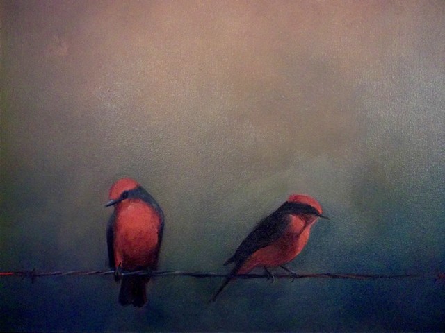
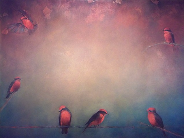
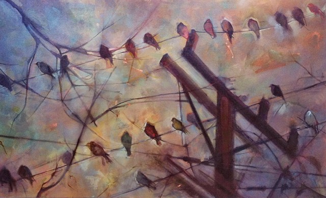
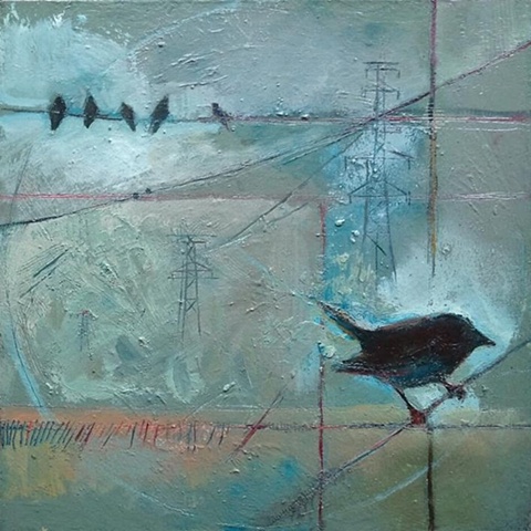
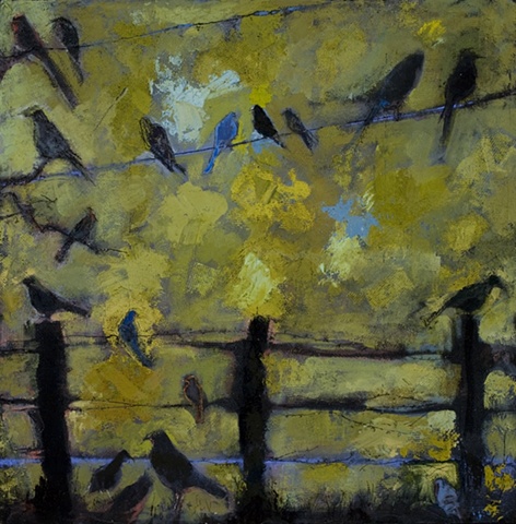
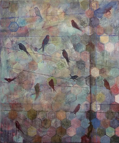
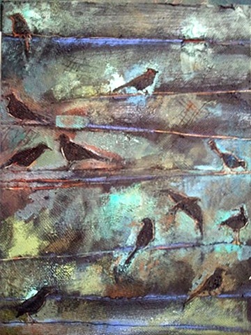
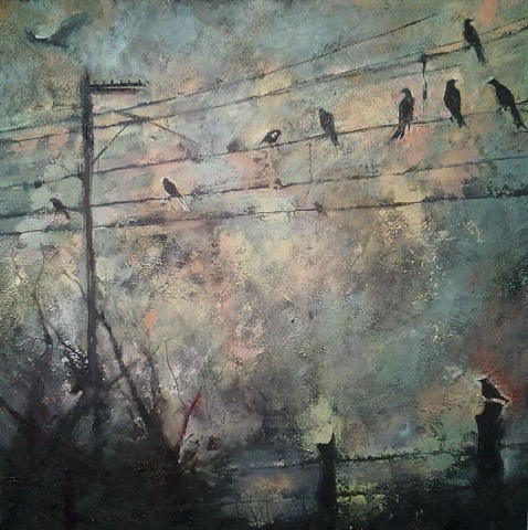
I have always wanted to fly, and often have dreams about flying. I think that this series of paintings is liberating me in a way that words cannot fully convey.